Like most movie geeks out there, I get giddy at the sight of many a movie studio's animated logo sequence before the start of a film. Although some may say that it's merely a meaningless logo, those who work in or have studied the graphic arts (or perhaps live in close proximity to someone that does) know that logos are powerful instruments that can build up or tear down companies. Additionally, they each speak volumes about not only the companies themselves but about the products that the companies deliver to you. If I were to sit you down in front of a TV and start the DVD player without telling you which movie you were watching, there's a chance you'd be able to tell me a little bit about the film you're about to see merely by seeing the logo. Don't believe me? What comes to mind when I say "Dimension Films?" Genre films, perhaps? The sight of the Pixar logo would not only tell you that you're in line for an animated film, but also that you're all but guaranteed of seeing a film of the highest quality. And I know I'm not the only one that grew up thinking the Fox theme music was tied to Star Wars.
Of course, not all of the studio openers can bring about such a rush of emotions or ties to specific genres. The fact is, they're just too big and release too many films to carry such a tie. They all go through ups and downs (Warner Bros. was the market share leader in 2009, with 20.1%, according to Wikipedia), so there's no real distinction there. Of the six (and aside from the Star Wars tie to so many twenty-, thirty- and forty-somethings), I'd say only Disney carries a real emotional bond, as well as being the only one where the sight of their logo gives an indication as to the type of film you're in for.
But we're not here to analyze the place in the market for each of the half dozen studios or their histories. We're here to grade their logo openers - what do they tell us, and how effectively do they tell it? I'll rank these in terms of their position in the market, just for the hell of it:
WARNER BROTHERS
What it says: "We're classy, and we remember our roots. Also, we're capable of levitation."
How effectively does it say it?: Good and bad. By playing "As Time Goes By" at the beginning of the clip, it reminds those who can or want to recall that "We are the studio responsible for Casablanca." But I wonder if those unfamiliar with what a studio lot looks like from above really can tell what's going on in those two seconds of screen time, especially with the ripple effect layed over it. Warner's logo hasn't changed all that much over the years, so the shield logo plays up the history of the brand even further. General comments: Why is the lot reflected in the side of the shield? There's a lot of information packed into 14 seconds. Also, Warner gets points for letting the theme of the film often shape the look of their logo. (Think Inception or Watchmen.) Overall grade: B+
20th CENTURY FOX
What it says: "We're located in Los Angeles - see Hollywood in the background?" "Come to us, now - please!" "Planes can't fly over us." "We're big-time - better get your VIP tickets if you How effectively does it say it?: As you can probably tell, I'm a bit torn as to what exactly the 20th opening is saying. Certainly it comes across as regal, and attempts to puff itself up by panning to make the, uh, icon thingy appear larger than it is by shooting it from below at the end. But beyond that, it kind of reminds me of that line from True Romance - you know, it shows me everything but tells me nothing. Unfortunately, True Romance was put out by Warner. General comments: It's sure hard to overcome that Star Wars tie. Overall grade: B-
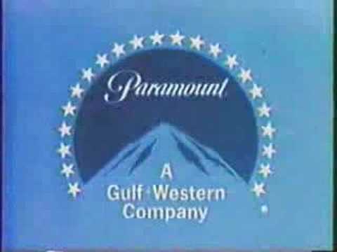
PARAMOUNT
What it says: Aside from the obvious literal translation, the hell if I know. But it's a hell of a lot better than this gawdawful thing. How effectively does it say it?: It says "Paramount," that's for sure. I had to go to Wikipedia to learn the meaning of the stars. General comments: First impression was, "Wow, I can't remember the last time I actually heard that music. Paramount must always let the film's score/soundtrack play over their logo." Perhaps not the best idea.
This one, too, has a strong sentimental tie, this time to the Indiana Jones films, where Spielberg cleverly began each film with a mountain or hill that closely resembled the Paramount mountain. Overall grade: C-
COLUMBIA
What it says: "We're ripoff artists with no creativity." How effectively does it say it?: Well, it says Statue of Liberty no matter how you spin it. The fact that she used to have the American flag draped around her and just some blue sheet is a step in the right direction, I think. I would have assumed the change to her blue drape occurred when Sony bought the company, but it actually changed years before that. General comments: My brother worked at Sony for a short time in the 90s, so I have a small tie to them, as receiving swag (A Last Action Hero hat! A Cliffhanger t-shirt!) was pretty cool to the 13-year old me. But that feeling has pretty much faded. This one's a stinker, and the old Tri-Star one (their now-defunct - at least form film distribution - sister company) wasn't a much better variant of essentially the same thing. Overall grade: D
DISNEY
What it says: "Hey, remember all that fun you had at Disneyland/world over the years? Well, here's 90 more minutes of it." How effectively does it say it?: Pretty damn well. Space Mountain doesn't make an appearance here, but it might as well. The Disney castle is iconic in just about any form. Playing "When You Wish Upon a Star" is right up there - if not better - than Warner's "As Time Goes By," as it evokes not only nostalgia to a time gone by, but childhood as well. General comments: I've never liked how the lake and plain fields continue in front of the castle. I want Main Street to be there, damnit! Overall grade: A
UNIVERSAL
What it says: "We'll be expanding past Earth any day now." How effectively does it say it?: Like many of the others, it proclaims "we're big and you're small" loud and clear. Other than that, I'm torn - I dig the music here, but the visuals...no matter how many times they spruce up this logo, it's still pretty boring, and I still think it looks outdated for it's version of Earth. They need to go more photographic. I know I'm not exactly talking about how effective their message is here, but that's only because the message seems simple, and I get it already. General comments: See above. Overall grade: C
Bonus! I'll be recapping this one again when I get to the smaller arms of these Big Six, but this one's a favorite.
FOCUS FEATURES
What it says: "We're not like all the other guys out there." How effectively does it say it?: I'm biased here. Their lineup isn't perfect by any means, but I swear, if I see that Focus logo, I feel like I'm guaranteed an interesting movie, if not a great one. They have an excellent track record of taking chances on original fare, and their logo only serves to support that record, giving the viewer a much different animal to start their film with. General comments: OMG! No clouds in a studio logo? Who let them get away with that?!?! Overall grade: A
8
people have chosen wisely:
on "Grading the Movie Studio Logo Openers - Part I: The Big Boys"
Nice, original post! I have to say, I do pay attention to the openers from time to time, and I agree that Focus definitely has a nice one. No clouds FTW.
I have a soft spot for Universal, just because of the darkness, then the light, then the music. It just screams "cinema" to me in a way that very little else does.
The Disney one seems... I don't know, overstated, almost?
Agreed on Focus, of all the mini-major (dependant on the studio, in this case, Universal, I believe) Focus is so clearly above the pack.
Albeit Fox Searchlight usually means a quirky kind of comedy often from the UK (Full Montey, Calender Girls, Waking Ned Devine, Saving Grace), so they have solid brand recognition in my books...
Darren - I can certainly appreciate your thoughts toward Universal. I think if one of them screams 'cinema' the most to me, it's Fox, but they go about it pretty blatantly. Universal's just doesn't have the same effect on me, though I wonder how much of that is due to seeing older versions of it and thinking it so hokey. It's updated, but I'm not sure if I can get past that.
Kurt - Good point about Fox...they're coming up soon. Sony Classics screams "Merchant Ivory" (or the like) to me like no other. Makes me wonder if any of their productions are U.S.-based (I'm sure they are, it just doesn't seem that way).
Aside from Pixar, Focus is the only brand that I associate with surefire quality. In the last few years, they've brought us (at least in Australia): The American, A Serious Man, Milk, Burn After Reading and In Bruges.
Fox Searchlight, on the other hand, seem to be the worst offender of delaying films for Aussie releases: we only got 127 Hours this week, Cyrus went straight to DVD, and we won't see Never Let Me Go until the end of March. I can only imagine how long we'll have to wait for Tree of Life :(
I LOVE it when studios let the movie alter their logo. Watchmen, Harry Potter and The Matrix are cool examples for Warner Bros., but I think Universal leads the field in this area. Just this year, Scott Pilgrim and Catfish both got out to great starts by playing around with the Universal globe.
Yeah, apparently, I'm not the only one that sees Focus before a trailer or the film I'm about to see and thinks, "Yay, I'm gonna like this movie!"
That sucks about Fox Searchlight. You know it's bad when you know that the films of a particular distributor don't make it there in a timely fashion, and even worse when they're the offshoot of a major player.
Universal might have stolen some thunder this year, but no way - Warner has got the market beat at altering their logo. Crap - there was a comment here before with a video I linked to, but it's gone now (Disqus change). Check this out.


8 people have chosen wisely: on "Grading the Movie Studio Logo Openers - Part I: The Big Boys"
Nice, original post! I have to say, I do pay attention to the openers from time to time, and I agree that Focus definitely has a nice one. No clouds FTW.
Gracias! I pay waaaay too much attention to the openers, I think.
Part II coming later this week...
I have a soft spot for Universal, just because of the darkness, then the light, then the music. It just screams "cinema" to me in a way that very little else does.
The Disney one seems... I don't know, overstated, almost?
Agreed on Focus, of all the mini-major (dependant on the studio, in this case, Universal, I believe) Focus is so clearly above the pack.
Albeit Fox Searchlight usually means a quirky kind of comedy often from the UK (Full Montey, Calender Girls, Waking Ned Devine, Saving Grace), so they have solid brand recognition in my books...
Darren - I can certainly appreciate your thoughts toward Universal. I think if one of them screams 'cinema' the most to me, it's Fox, but they go about it pretty blatantly. Universal's just doesn't have the same effect on me, though I wonder how much of that is due to seeing older versions of it and thinking it so hokey. It's updated, but I'm not sure if I can get past that.
Kurt - Good point about Fox...they're coming up soon. Sony Classics screams "Merchant Ivory" (or the like) to me like no other. Makes me wonder if any of their productions are U.S.-based (I'm sure they are, it just doesn't seem that way).
Aside from Pixar, Focus is the only brand that I associate with surefire quality. In the last few years, they've brought us (at least in Australia): The American, A Serious Man, Milk, Burn After Reading and In Bruges.
Fox Searchlight, on the other hand, seem to be the worst offender of delaying films for Aussie releases: we only got 127 Hours this week, Cyrus went straight to DVD, and we won't see Never Let Me Go until the end of March. I can only imagine how long we'll have to wait for Tree of Life :(
I LOVE it when studios let the movie alter their logo. Watchmen, Harry Potter and The Matrix are cool examples for Warner Bros., but I think Universal leads the field in this area. Just this year, Scott Pilgrim and Catfish both got out to great starts by playing around with the Universal globe.
Yeah, apparently, I'm not the only one that sees Focus before a trailer or the film I'm about to see and thinks, "Yay, I'm gonna like this movie!"
That sucks about Fox Searchlight. You know it's bad when you know that the films of a particular distributor don't make it there in a timely fashion, and even worse when they're the offshoot of a major player.
Universal might have stolen some thunder this year, but no way - Warner has got the market beat at altering their logo. Crap - there was a comment here before with a video I linked to, but it's gone now (Disqus change). Check this out.
...well played sir. Well played
Post a Comment